
from
zero.
I turn early-stage ideas into distinctive products and brands ready to launch and grow, from shaping brand direction and creative strategy to product strategy, UX and high-quality design, working directly with founders and alongside venture studios and accelerators. My 0→1 experience spans emerging AI, SaaS and technology businesses. This year I’m super excited to also be working with the Female Founders network as part of their Autumn 2026 Bootcamp.

Brand Direction, Product Guidance & Creative treatment
Challenge
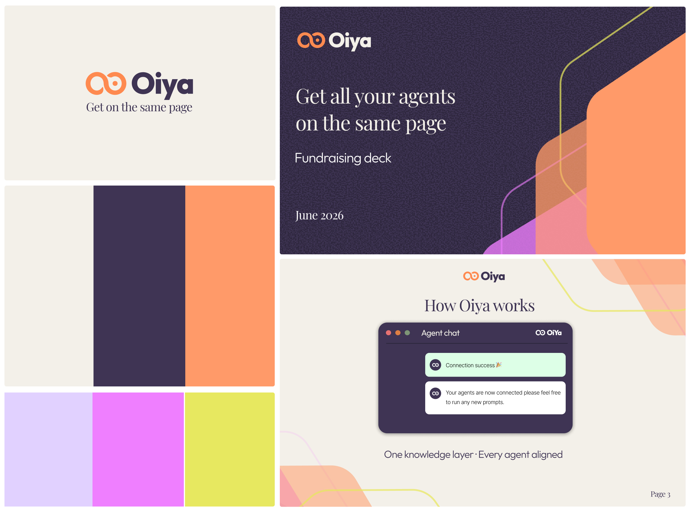
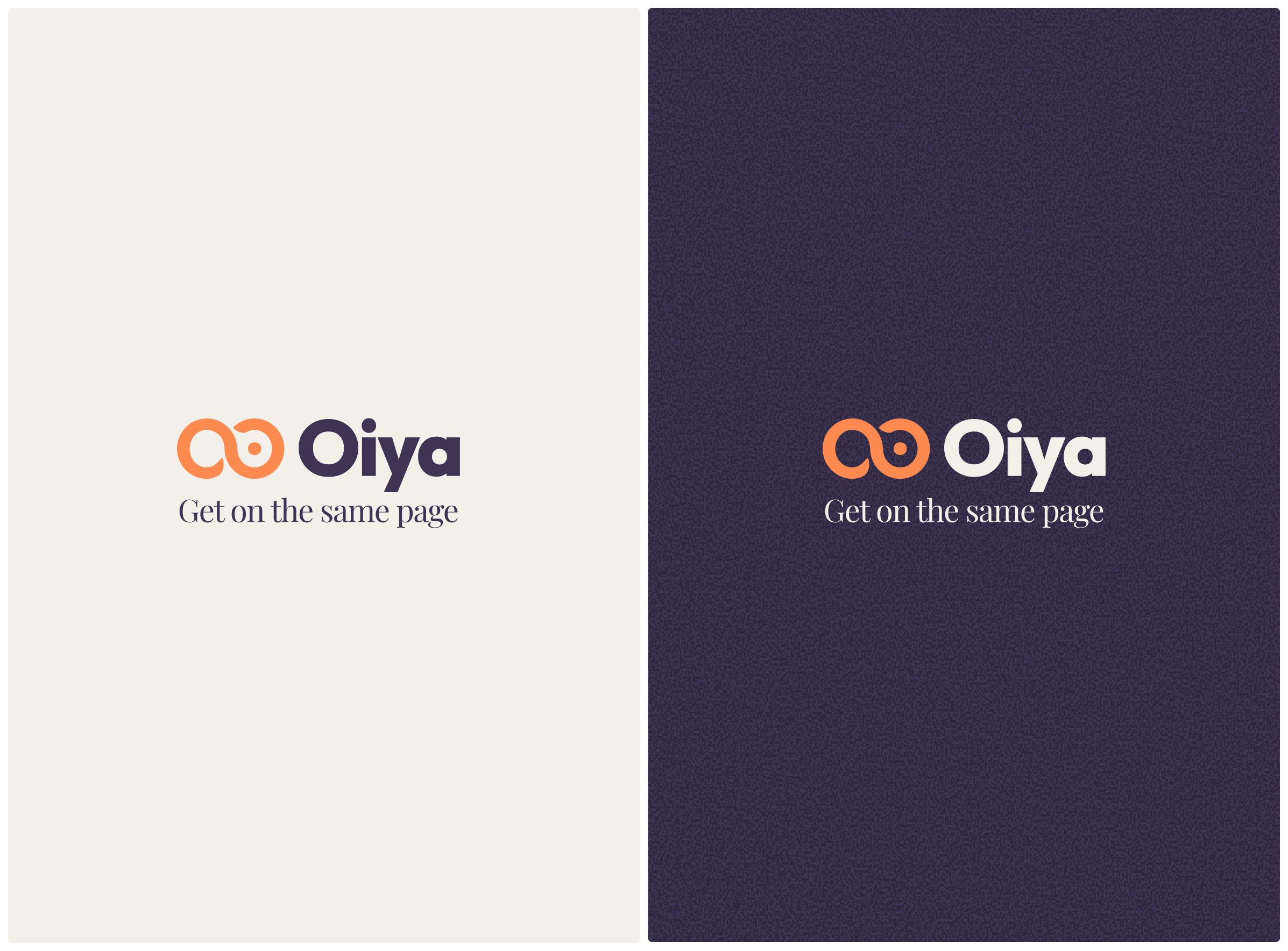
Oiya wanted to evolve its early identity into a distinctive, technology-native brand with a refined visual language that could scale across presentations, website and product. Working from an existing icon, the challenge was to develop the wider creative expression around it, including typography, colour palette, visual treatments and brand guidelines, alongside a fundraising deck to help communicate the business and its vision.
Approach
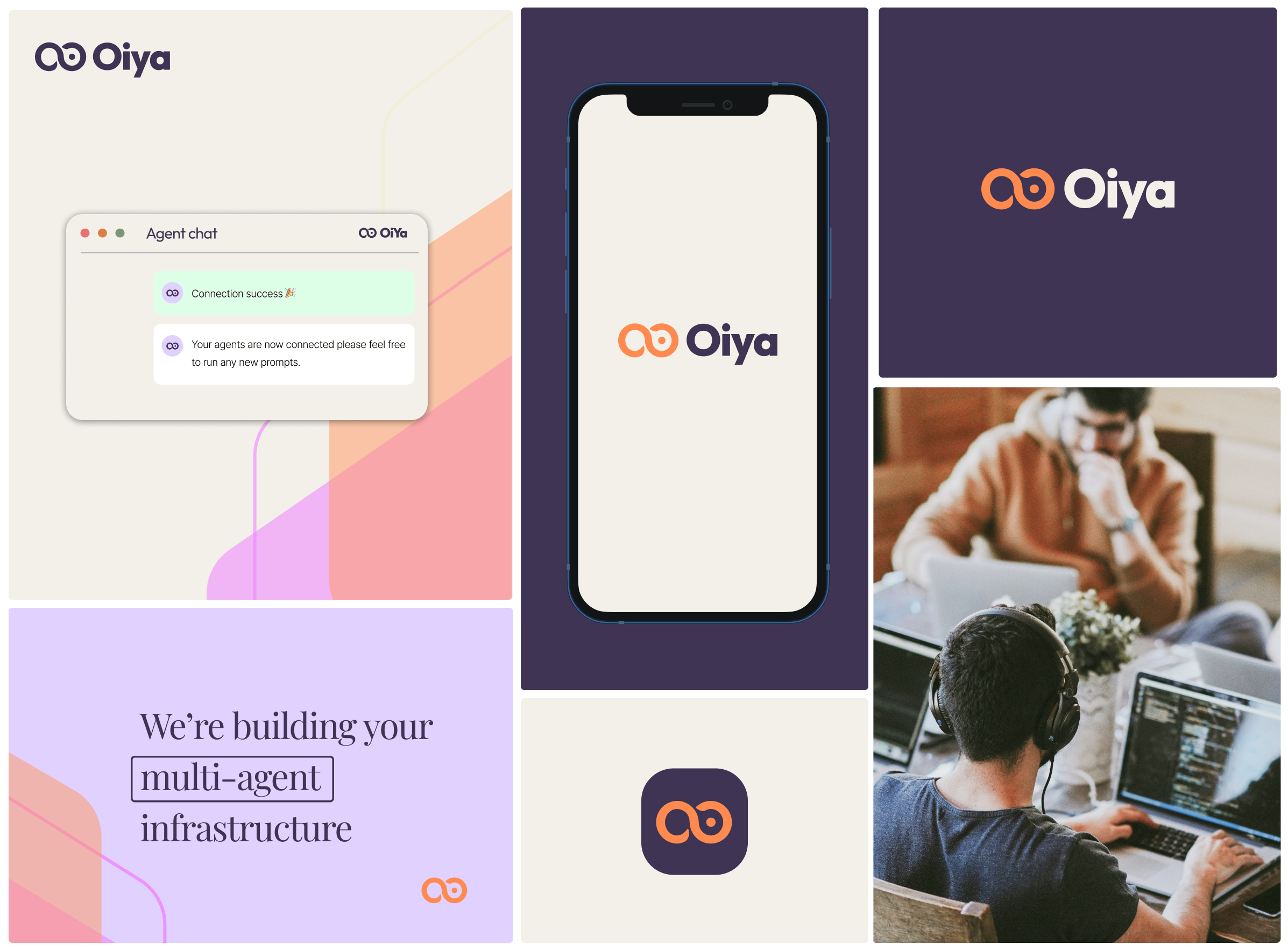
Working closely with the founders, I defined a creative strategy and treatment, refined the existing icon and developed a broader visual language that positioned Oiya more confidently within the technology space. I defined the typography and colour systems, developed the creative treatment and created brand guidelines to give the team a consistent framework for applying the identity across different touchpoints. Alongside the brand direction, I provided high-level product guidance to help create greater consistency between the emerging product experience and the wider Oiya brand.
Outcome
Oiya gained a refined identity and flexible visual system that gave the founders a clear foundation for advancing the brand across presentations, website and product.

Brand Direction, MVP Product Guidance & Creative treatment
Challenge
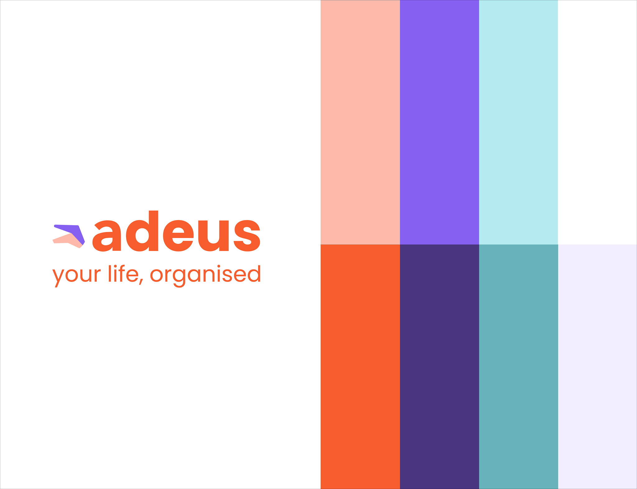
Adeus was creating a digital will service and needed to turn its early-stage vision into a brand and product experience ready for launch. The challenge was to create an identity that could bring clarity and humanity to a traditionally complex and sensitive category, while defining the direction for an intuitive digital service.
Approach
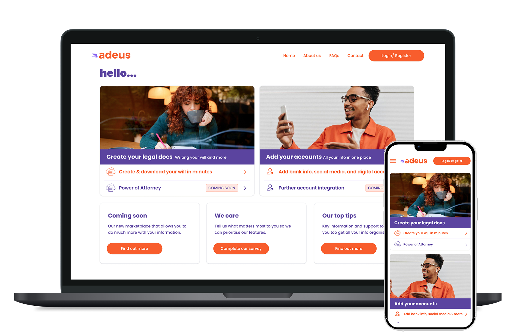
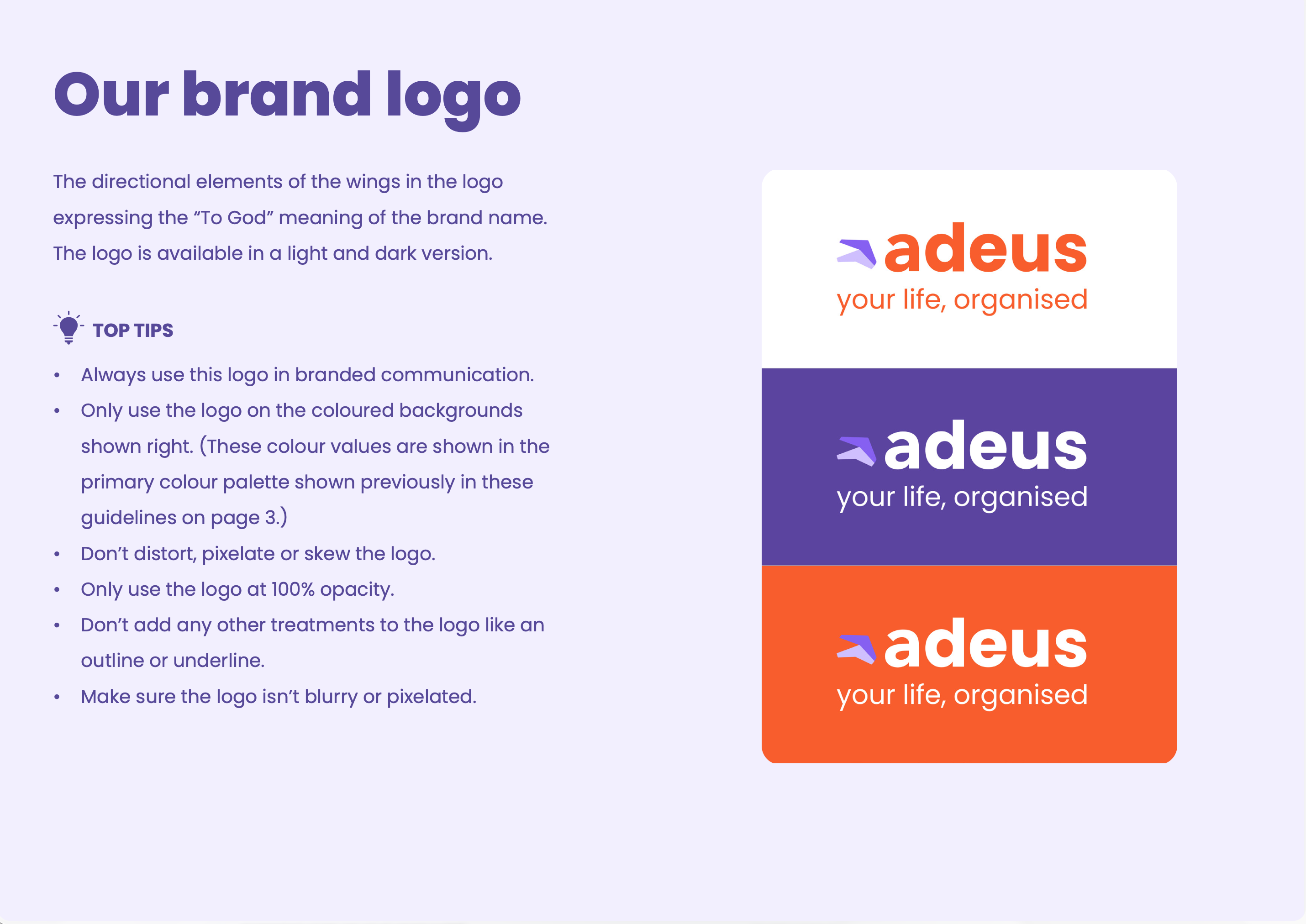
Working closely with the founders, I developed the brand direction and launch identity, creating the visual language and creative foundations for the business. Alongside the brand, I shaped the direction of the MVP, translating the proposition into a clear digital experience and establishing the design direction for its development. I also created the fundraising deck, bringing the proposition, brand and product vision together into a compelling story for potential investors.
Outcome
Adeus launched with a distinctive identity and a clearly defined MVP experience, giving the founders a cohesive foundation across brand, product and fundraising as they took the business to market.

See my other 0-1 client's featured
Got an idea you need help bringing to life
I work with founders, venture studios and accelerators to turn early-stage ideas into distinctive brands and product experiences ready to launch and grow.
Get in touch